
Platform Web App
Service Customer Care & Billing
Tool Adobe Xd
PAGESCAN - WEBSITE HEALTH CHECK
Disclaimer: All the names and screenshots have been modified to comply with my non-disclosure agreement. This case study reflects my own opinions, not necessarily the view of the company.
OVERVIEW
PageSCAN is a free and online tool for checking web SEO performance, detecting the speed bumps and hinting at the solutions. After that, if the users are willing to pay, PageSCAN can offer a package to improve their websites and even promote them on popular social channels.
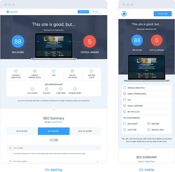
As PageSCAN is just a freebie and also has to compete against other similar services on the market, it’s stuffed with as many metric values as possible, so that users cannot look elsewhere.
THE PROJECT
As a product designer, I need to figure out a way to help users, who are both company members and the customers, quickly navigate to the content of interest on the mobile phone without breaking the page consistency and transparency.

ORIGINAL STATE
PageSCAN report page includes:
-
SEO Summary
-
Pay-Per-Click
-
Google Analytics
-
Mobile Friendliness
-
Social Network
-
Site performance
-
The bottom line
-
Contact form
UI treatments used for shortening the page are accordions and tabs.
However, on mobile, the page remains lengthy.
THE PREP
COMPETITIVE RESEARCH
I listed out 10 popular tools on the first page of Google that also measure website performance, then I analyzed how they present the report/analysis page on both desktop and mobile phone.
Similarweb has quite an interesting UI treatment for desktop, which is the sticky menu on the left-hand side for quick navigation to a specific section.

WORK BREAKDOWN
Even though this feature is small and the work is light, I still need to start with an epic and a clearly stated task to keep track of all my works.

THE WORK
NEW STICKY NAVIGATION SIDEBAR
inspired by Similarweb, I prototyped the sticky navigation bar on both desktop and mobile. The title of 7 sections will act as an anchor link, each link in the navigation is illustrated with colorful icons and text to make it look more appealing.

On the desktop design, the navigation is positioned on the right-hand side, as the majority of users use the right-handed mouse and the cursor movement from right to left is more natural.

On the mobile design, the navigation remains on the right and sticks to the top corner. For an even better experience, the section icon will be changed accordingly when users scroll to a section.

FINALIZATION AND HAND-OVER
After finishing the hi-fi prototype, I presented it to the Product Owner, Marketing and Development teams, and let them try interacting with the prototype.
After discussing back and forth, everyone was happy with the hi-fi prototype and I handed over the design specs to the developers via Zeplin.

Sometimes compromise is unavoidable no matter how vocal you are about the product experience. After quite a while working in several projects, small or large, billable or non billable, I finally look at the term “compromise” in a new light - Compromise is just another way we designers adapt to the situation and find a sweet spot among conflicts.
In the E-Invoicer project, thanks to all the micro-compromises I encountered along the way, I’ve had a chance to loosen up myself gradually so that I can be open to all the possibilities.
